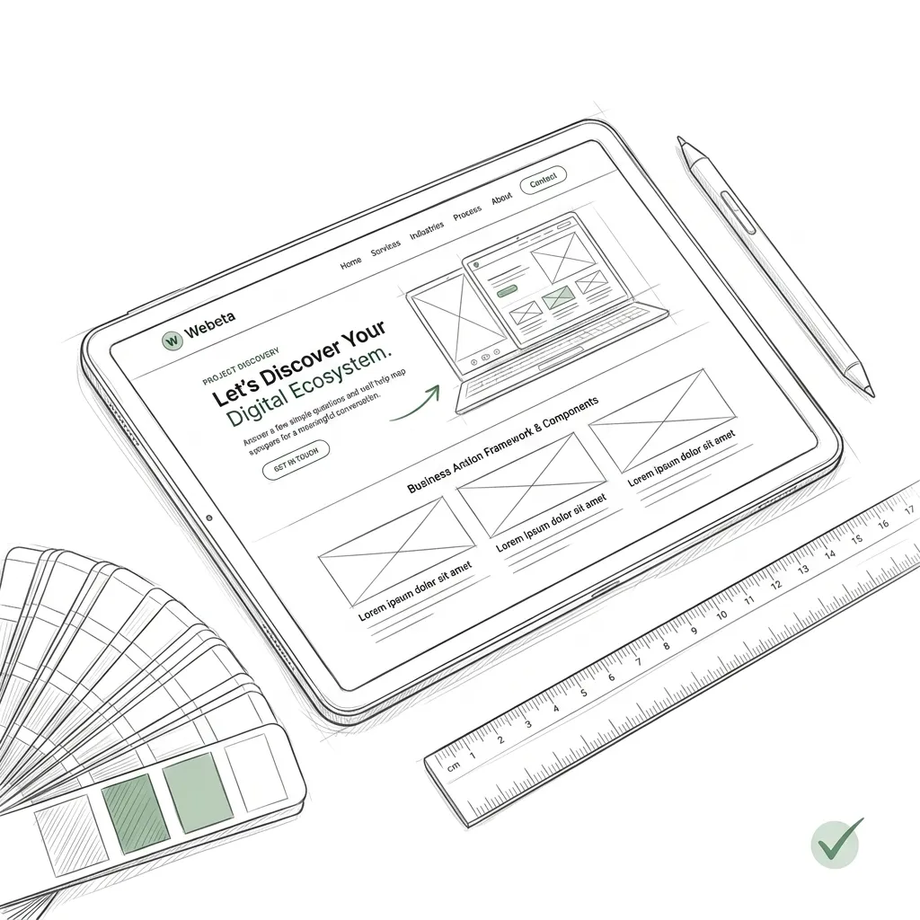
When prospective B2B clients or consumers hit a massive, intimidating form with 18 input fields, their immediate biological reaction is cognitive fatigue and avoidance. The brain evaluates the effort required, calculates the risk of spam, and hits the back button. Yet businesses genuinely need deep qualification data: project budgets, timelines, technical constraints, and decision-maker contact details. By re-architecting monolithic lead forms into progressive multi-step onboarding wizards, product teams slash form abandonment by over 40% while capturing richer, higher-intent lead profiles. Here is the cognitive psychology and UX architecture behind high-converting multi-step wizards.
Key Takeaways
- The Foot-in-the-Door Technique: Step 1 must require virtually zero effort (e.g., selecting an industry via large 1-tap visual cards). Once a user takes the first micro-action, psychological momentum drives them to completion.
- The Zeigarnik Effect & Progress Bars: Human psychology hates uncompleted tasks. Displaying a clear progress indicator with percentage completion (e.g. 'Step 2 of 4 — 50% Complete') dramatically lifts persistence.
- Defer Sensitive Fields to the End: Asking for phone numbers, work emails, and corporate budgets on Step 1 destroys conversion. Defer contact capture to the final step after the user has invested 60 seconds building their project scope.
- State Persistence in LocalStorage: If a user accidentally closes their tab or navigates back, form progress must be preserved so they resume without re-typing.
- Webeta's Standard: All custom discovery wizards and customer onboarding workflows built by Webeta leverage progressive disclosure, keyboard navigation, and instant CRM synchronization.
The Cognitive Psychology of Form Abandonment
Form abandonment is rarely about the questions being asked; it is about cognitive overload and perceived friction:
- Visual Overwhelm: A single page containing 15 text inputs, 4 dropdowns, and multiple checkboxes feels like a tax audit. The brain perceives high cognitive friction before the user even reads the first label.
- Premature Commitment Threat: Demanding an email and phone number immediately triggers skepticism: 'Will they bombard me with pushy sales calls?'
- Sunk Cost & Psychological Momentum: When a user answers three intuitive multiple-choice questions about their project goals, they experience an investment of effort. They are significantly more likely to provide their contact information on Step 4 to avoid 'wasting' their prior answers.
Monolithic Form vs Multi-Step Progressive Wizard
| UX Parameter | Monolithic Single-Page Form | Multi-Step Progressive Wizard |
|---|---|---|
| Initial User Impression | Intimidating wall of inputs; feels like homework | Inviting, interactive 1-tap question; feels like a quiz |
| Question Grouping | Cluttered and unorganized on single screen | Logical buckets: 1) Goals, 2) Scope, 3) Timeline, 4) Contact |
| Contact Info Placement | At the very top; high drop-off | At the final step after value and scope are established |
| Mobile Ergonomics | Continuous keyboard popping up and down | Tap-friendly cards with auto-advancing transitions |
Engineering Deep Dive: Smooth Multi-Step State Engine
A great wizard should feature auto-advancing single-select steps, URL history synchronization (so the browser 'Back' button steps back in the form rather than leaving the page), and local persistence:
Need help with your tech stack?
Our engineering team specializes in scalable web architectures.
The Production Wizard Checklist
Before launching your multi-step onboarding wizard, verify these critical UX requirements:
- Support Keyboard Navigation: Allow power users to navigate between steps using the Enter and Tab keys without touching the mouse.
- Inline Real-Time Field Validation: Validate email formats and phone digits as the user types; never make them click 'Submit' at the end just to see an error on Step 2.
- Partial Lead Abandonment Webhook: If a user enters their email on Step 3 but drops off before Step 4, save the partial lead to your CRM so your sales team can follow up with a helpful concierge email.
Ready to build your digital ecosystem?
Let's talk strategy. We design and engineer premium platforms for industry leaders.
Start Project DiscoveryReady to build your digital ecosystem?
Let's talk strategy. We design and engineer premium platforms for industry leaders.
Start Project Discovery