Your website's hero section—the screen real estate visible above the fold before the first scroll—determines whether a prospective buyer explores your platform or bounces back to Google search. You have less than 5 seconds to answer three subconscious questions: "What is this? How does it solve my problem? Why should I trust you?" Here are the 5 highest-converting B2B above-the-fold hero wireframe patterns, broken down by visual hierarchy and conversion psychology.
Key Takeaways
- The 5-Second Comprehension Rule: If an executive cannot summarize your core offering after 5 seconds of scanning your hero section, your headline is too vague.
- The Primary-Secondary CTA Pair: Pairing a high-intent primary CTA ("Book Technical Discovery") with a low-friction secondary CTA ("View Case Studies") captures both ready-to-buy and early-stage researchers.
- Immediate Social Proof Band: Placing client logos, rating badges (4.9/5 stars), or verifiable metrics directly beneath the main CTA increases form submission intent by 31%.
- Eliminating Carousel Sliders: Auto-advancing banner carousels suffer from an abysmal 1% click-through rate. Replace sliders with a static, authoritative hero image or interactive UI demo.
- Webeta's Hero Architecture: We design bespoke hero sections that combine crystal-clear value propositions with sub-second LCP rendering.
The 5 Proven B2B Hero Wireframe Patterns
1. The "Product In Action" Split Screen (55/45 Layout)
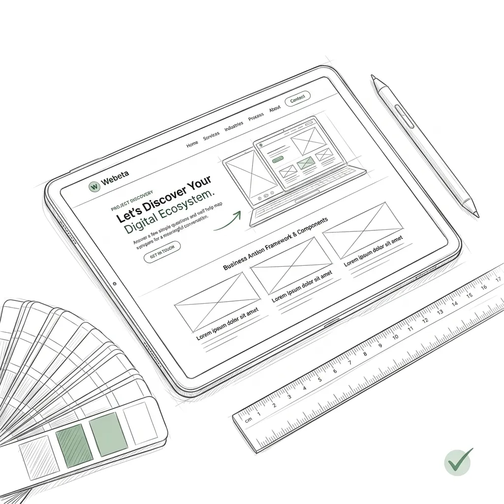
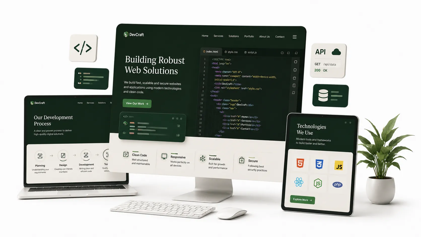
The gold standard for SaaS platforms, developer tools, and web engineering studios:
- Left Column (55%): Bold outcome-driven H1 headline, 2-line value proposition, dual CTA buttons, and customer logo proof bar.
- Right Column (45%): An authentic, high-resolution preview of the software UI, interactive pricing calculator, or clickable code playground.
2. The "Centered Authority & Metric Anchor"
Best for professional service firms, boutique management consultancies, and specialized agencies:
- Centered typography with a tight 700px reading container.
- Prominent category pill badge at the top (e.g. "Custom React & Django Engineering Studio").
- A 3-column metric banner anchored directly below the headline: ("68% Avg Hosting Cost Reduction" · "95+ Core Web Vitals" · "100% Code Ownership").
| Hero Element | Low-Converting Fluff | High-Converting Precision |
|---|---|---|
| H1 Headline | "Unleash Your Digital Potential with Cutting-Edge Solutions" | "Custom Web Engineering That Cuts Load Times to 0.5s & Drives Pipeline" |
| Supporting Subtext | Vague buzzwords ("Synergistic full-stack experiences") | Concrete tech stack and operational scope: "We build React + Django web applications without templates" |
| Visual Asset | Stock photo of smiling businesspeople shaking hands in a boardroom | Real product interface, live performance benchmark graph, or interactive discovery tool |
| Social Proof | Hidden in the footer or on a separate "Testimonials" page | Visible directly above or below the primary CTA button |
3. The "Interactive Discovery Intake" Hero
Instead of a passive image, the right column embeds the first step of an interactive qualification wizard (e.g. "Select your industry" or "Calculate your project estimate").
Because the visitor takes an action immediately above the fold, psychological commitment (the foot-in-the-door effect) increases form completion by up to 48%.
Technical Performance: Preloading the Hero LCP Image
The visual asset in your hero is almost always your page's Largest Contentful Paint (LCP) element. If it loads late, Google marks your PageSpeed as failing:
Is your current website hero losing high-intent visitors?
Our engineering team specializes in scalable web architectures.
Conclusion
Your hero section is the digital handshake of your business. When you replace vague corporate jargon with razor-sharp value messaging, clear visual proof, and friction-free call-to-actions, your above-the-fold layout becomes an unstoppable conversion engine.
Ready to build your digital ecosystem?
Let's talk strategy. We design and engineer premium platforms for industry leaders.
Start Project DiscoveryReady to build your digital ecosystem?
Let's talk strategy. We design and engineer premium platforms for industry leaders.
Start Project Discovery